"Clients are the difference between design and art."
- Anonymous
---
I really enjoy this logo.

Not simply because of its simple black and white "color" scheme.
Not just due to its clean, sans-serif typography.
As a designer, what I particularly enjoy is the inside joke.
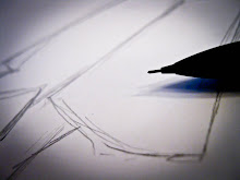
An average person would take a look at this logo and notice that it says "CURVE." And it does. Then, they might notice the line to the left, and wonder why a curve might include a thinner line coming out of its back, or perhaps why one of the squared ends is filled while the other is empty.
But for anyone who's ever used a program like Adobe Photoshop or Illustrator, that curve is much more than your average curve. It's the easily recognizable form of the Pen tool, with the open-ended node at the bottom and the direction handle jutting out to the left of the second, closed anchor point.
The picture is an icon, one that is a good representation of the general life of a graphic designer because anybody aspiring to become one should probably have a good grasp of how to use this tool. Because of this relationship, such an image is perhaps a perfect logo for a design studio.
Looking past the symbolism however, it's still a nice logo. The kerning between letters is a good width that promotes visual balance of figure versus ground, as well as having an aesthetically pleasing spatial separation. The gray shade of the words "design studio" provide a nice midpoint between the bold black logo and its white background, and thus seem to recede into the background, giving the illusion of depth. The thinner line is also parallel to the baseline of the type, which creates an implied line across that top that encloses the entire item.
An average person would take a look at this logo and notice that it says "CURVE." And that's the beauty of it.
---
Source: http://logofaves.com/2010/09/curve-design
No comments:
Post a Comment